There's a little over two months until 2017, which means that it's time to check out next year's color trends - in paint! It's time to put away 2016's Simply White, and bring in some color.
We take a look at the 2017 Colors of the Year from leading paint brands.
Benjamin Moore - Shadow
(photo via Benjamin Moore)
Dramatic, dark,and luxurious - Benjamin Moore has opted for Shadow, a dark purple hue, as 2017's Color of the Year. A showstopper shade by itself, Ellen O'Neill, creative director of Benjamin Moore describes the color as, "It ebbs and flows with its surroundings, and light brings it to life. Rich, royal amethyst can fade into the soft lilac-grey of distant mountains or morph into lustrous coal. Indulge your mysterious side. Let Shadow set the mood.”
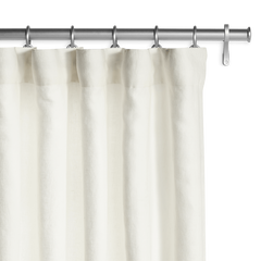
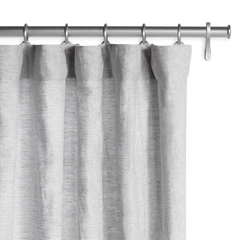
Pair the color with airy, Belgian linen fabrics, like the Belgian Sheer Linen in Off White or an unlined Mist Gray fabric like the photo above. A bright white, like the Belgian Flax Linen in Optic White, can add a beautiful contrast to an otherwise dark space.
Dunn-Edwards - Honey Glow
One of the more cheerful shades on the list this year, Dunn-Edwards chose a warm golden yellow for their Color of the Year. "This is a great color to make a bold statement in a room," said Sara McLean, color expert for Dunn-Edwards. "Whether it's applied to every wall or featured in accessories, the cheerful spirit that radiates from this color will re-energize any room."
A bold yellow, this color pairs well with any of the colors in the Barn & Willow collection. For a softer appearance, pair it with a Washed Belgian Linen in Sand, or a Sheer Belgian linen in Off White. For more contrast, try a Belgian Laundered Linen in Dark Gray.
Glidden - Byzantine Blue

Photo via Glidden
Glidden has opted for a softer color this year with Byzantine Blue, a muted, blue/purple shade. Misty Yeomans, the PPG marketing manager of Glidden paint says, “The name may say blue, but Byzantine Blue is truly a purple in disguise. It stretches the boundaries of purple to borrow all of best qualities of blue and gray, making it an appealing color choice for nearly any room.” Glidden recommends pairing the color with "concentrated down-to-earth colors that promote a sense of tranquility and wellness, from brown-bag tones and beachy driftwood neutrals to charcoal and gray-infused blues and greens."
This color, as suggested, pairs best with neutrals or other tranquil tones. We suggest pairing it with white or gray curtains, for a timeless, classic look. For a bold, dark statement, try a Belgian Flax Linen in Chocolate.
Sherwin Williams - Poised Taupe

Photo via Sherwin-Williams
Poised Taupe is a beautiful neutral that modernizes the classic taupe shade. Sue Wadden, the director of color marketing for Sherwin-Williams, told the Today Show: "It's like gray and brown had a baby. It signals a new direction in society's ever-growing thirst for beautiful neutrals that bring warm and cool tones together to create one irresistibly versatile color."
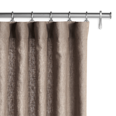
For taupes, a Belgian Flax Linen in Oatmeal would work well for an understated, and elegant appearance. Otherwise, we suggest window coverings with a Belgian Flax Linen in Off White.
For more tips on matching window treatments with wall color, check out this post here!
--------
What do you think about these colors? Will you be painting your home in any of these colors? Let us know in the comments!


