A while ago we teamed up with blogger Kris from Driven by Decor to help her spruce up her living room with some of our Belgian Linen pillows. We thought the results were great and even shared her photos with you previously. But we just kept coming back to Kris' living room photos and felt like there was so much more to share than just the pillows. Her living room is very thoughtfully designed and offers a lot of tips for readers like you who need some inspiration for your own decor. We get it - playing interior designer can be hard, especially when you're trying to do a small makeover and working with things you already have. Where do you put the stuff! What do you toss and what do you keep? So many questions! To help, we're pointing out interior design tips from Kris's living room that you can try in your own.
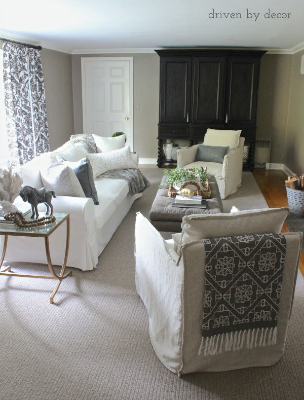
1. Pick a softer color palette with one dark color as the accent. Here Kris kept to white and neutrals but is using navy as her accent color to draw the eye around the room. See for yourself: your eye starts with the throw on the back of her chair, then jumps to the curtains and ends at the wardrobe, making the room feel large and put together. Try this tactic in your own space.
2. Add accent furniture that almost blends into your larger furniture. Take a look at the side table with the horse on it; the gold legs match the gold animal figure on the centerpiece. The light/clear top then easily guides the eye into the couch since they are a simliar shade. This tactic makes everything feel cohesive.

3. Add a textured throw, like this shaggy one here. Since her couch and pillows are clean linen, a textured throw adds, well, texture to the room which is pleasing to the eye. Plus, I bet it's great to get cozy with on the couch! Take a look at some of these throws to get you started.
4. Add fun pieces to your side and coffee tables. As you can see, Kris has animal and nature figures, as well as a small stack of books. Each table is decorated differently, but stick to the same theme so it works. What we really love is that these pieces aren't overpowering (example: a really tall side-table lamp) so the easy flow of the room stays while adding personality to it.

5. Don't be afraid to mix fabrics with your pillows! As you'll notice, Kris has multiple fabric types on her couch and chairs, but instead of looking chaotic, they all work well together since they fall into the color palette she picked out. Just like adding a textured throw, different fabric are pleasing to the eye and help liven a room up.
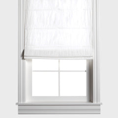
6. If you want patterned curtains, make sure the "pattern" part of it is your accent color. Kris' curtain are the perfect example since the navy pattern really helps to draw the eye around the room. If her curtains were, let's say, all navy, visually you would be "stuck" on them which is something you don't want when decorating. Plus, did you notice how the curtain pattern is a bit similar to this white pillow's pattern? They complement each other and makes each piece feel like it belongs. If you want to have a solid color drape, pick one that is softer and neutral, like these drapes.

7. Lastly, change up the pillow and throw blanket sizes! All your throws don't have to be the same size to work together, and actually we recommend NOT having all the same sized accent pieces. A large square pillow would look too big on this chair, so this rectangle one, found here, works very well. Same thing goes for throw blankets - a small one on a big couch would look out of place, wouldn't it?
We hope these tips help you feel inspired to makeover your living room! Remember, the key is to stick to a color palette and mix things up within the palate so everything works together. Happy decorating!


