Choosing the perfect paint color is one of the most exciting parts of a home renovation project. But it’s not always the easiest! With thousands of paints and shades to choose from, it can sometimes be difficult to narrow down your options.
So how do you get from countless colors to your perfect shade? Just one way to approach it is the classic: white. That said, white may be FAR more interesting than you ever realized. Did you know choosing the right shade of white can help completely transform your space, highlighting other colors in your art and decor, and complementing elaborate architectural details? It can even bring a generally open, airy and tranquil feeling to your home!
Source: Remodelista
Here are Paintzen's top five tips for selecting the perfect shade of white for your next paint project. As an added bonus, they’ve also included some of our favorite shades of Benjamin Moore whites to choose from!
Decide on the Tone of the Room
If you're looking for a modern aesthetic, you’ll want to lean towards cooler, grayer whites, or the closest thing to a pure white you can find. Pure whites make a room feel sharp, clean and crisp, and will make other colors pop! If you’re looking to achieve a cozier feeling, whites with red or yellow undertones have a creamier appearance and will be the better choice. You often see warmer white in bedrooms, cozy dens or traditional kitchens.
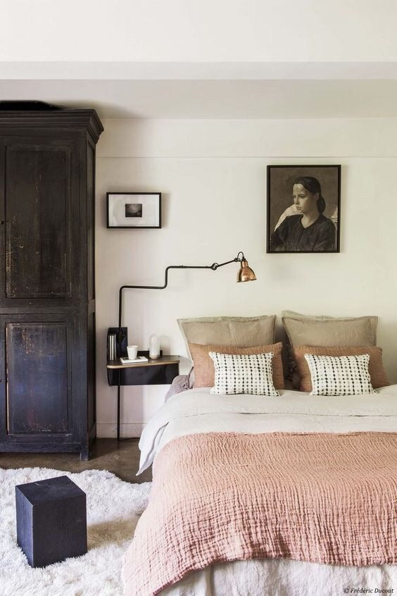
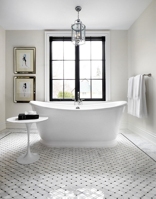
Source: Frederic Ducout
This dreamy bedroom is painted in Benjamin Moore Linen White. A decorator favorite, it's clean and comfortable as fresh linen, it relies on a yellow undertone for added warmth.
Avoid Holding Whites Against One Another
One of the top but lesser known tips: do your best to avoid holding two or more swatches of white paint up against one another. They can be each other’s worst enemies! One could make the other look too yellow, or grayer than it actually is. Let each color speak for itself, and only compare it with elements it will come directly in contact within your home (i.e. your floors, furniture, window treatments and any artwork you may be hanging over it!).
Consider the Lighting
Both natural and artificial lighting will influence how white paint looks on your walls. In a room with lots of natural light, choose the purest white you can find. The light will reflect off the walls, illuminating the room! If you rely more on an artificial light in your home, you should test how your chosen paint color reacts to it. If the lightbulbs you use to give off warm, yellow light, opt for cooler whites to balance it out.
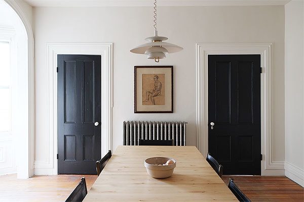
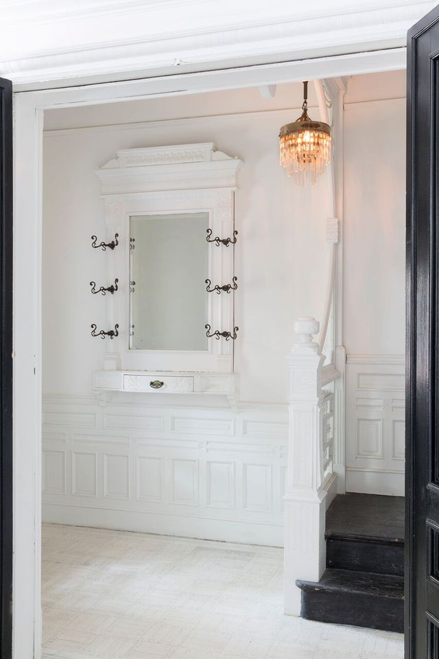
Source: Manhattan Nest
Keep the Geographic Region in Mind
In different cities across the country, the natural light you are exposed to will differ on the warm-cool spectrum. For example, homes in the Pacific Northwest have a higher chance of being subject to a grayer white, filtered through overcast clouds. In contrast, the rays of sunlight streaming into homes in Miami will feel bright and blue. Check into the type of light your home receives to help determine your perfect white.
Don’t forget Other Elements of the Space
At the end of the day, it’s not really about just the wall color, it’s about the bigger picture. If you’ve got lots of elaborate trim that you want to pop, a bright white in a semi- or high-gloss is your best bet. If you’re painting a wall in a high traffic area like a hallway, you may be better off choosing a flat finish (better for touch-ups) in a slightly off-white, to hide imperfections. Have some gorgeous new window treatments? Use these as the focal element of the room, and choose a white that complements your new curtains!
Shop this look with Belgian Linen Drapes in Optic White
Still, need some help? Here are some of their top whites!
Paintzen's Top Favorites:
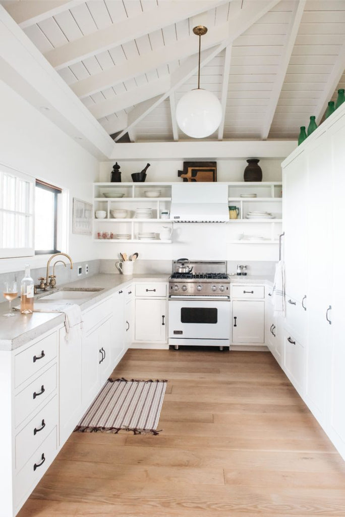
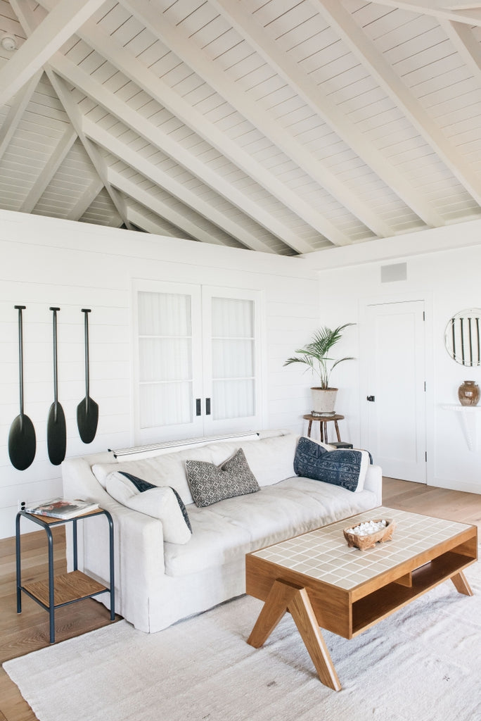
Source: Remodelista
Kitchen painted in Simply White
Pure Whites:
Source: Bloglovin
Cooler Whites:
Source: Pinterest
Living Room painted in Wedding Veil
Warmer Whites:

Source: Brunch at Saks
Bedroom painted in Ivory White
Want to learn more about paint color selection? Schedule a free color consultation with a Paintzen representative, and get a free quote for painting your home! Barn & Willow customers can save $100* on their Paintzen projects with code BARNANDWILLOW. Get started now!
*With qualifying job size of $1,000 or above. Jobs below $1,000 will receive $50 off.


