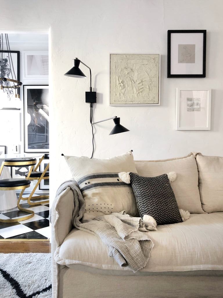
Welcome back to our View From Here series! This week, we're taking a virtual tour of Brady Tolbert's classy curated home and his experiences with interior design. We've been smitten with Brady's designs since forever, so we're excited to share his story and designs with you.
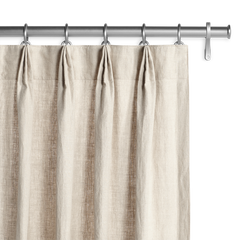
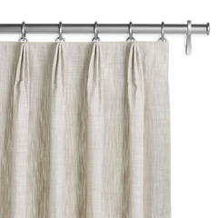
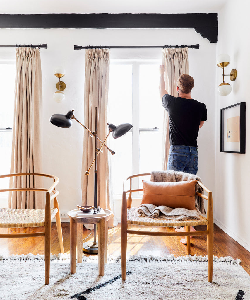
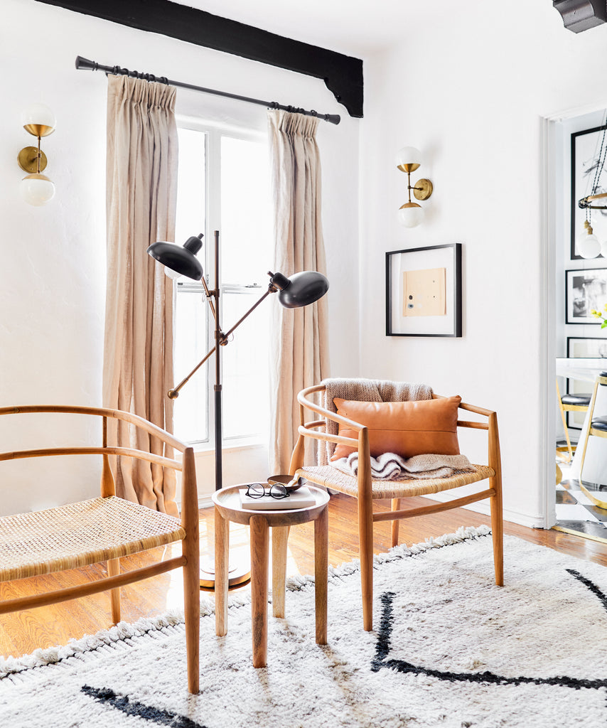
To create his beautiful warm living room, Brady used Belgian Linen drapery in Oatmeal and added Euro Pleats for a classy finish to his windows. Check out more of his home below!
Tell us a bit about yourself! When did your love for interiors begin?
My love for design and interiors goes back as far as I can remember. I vividly remember as a kid drawing up floorplans and moving furniture around in my parents home until it “looked right”. My room was constantly changing colors, decor styles and what it contained. My parents fostered an environment of creativity in all aspects, and for me that sometimes meant dragging an old chair left out on the street into our backyard to figure out how to paint it or reupholster it in middle school. Looking back I am sure most of them were more drab than fab but I loved the thrill of the hunt and transformation. My dad is someone that always had a “if you don’t know how to do it, we can figure it out” attitude and I think that translated very much into my DIY and design skills.
I went to school for both music and architecture, and what really propelled me into design happened a few years into college while in the architecture department. I applied for an internship working on a presidential memorial that Frank Gehry was building in Washington, D.C. and got it. He constantly challenged the rules and I loved that about him. He created first then designed later. From there I met a designer out in DC who offered me a job here in LA as a base level office assistant and then worked for him for two years and then moved into working with Emily Henderson for just over 5 years. I worked as her Editorial and Creative Director and now currently work as the Creative Director for Bobby Berk, of Netflix’s Queer Eye.
Imagine a guest walks into your home. What’s the first thing you want them to notice?
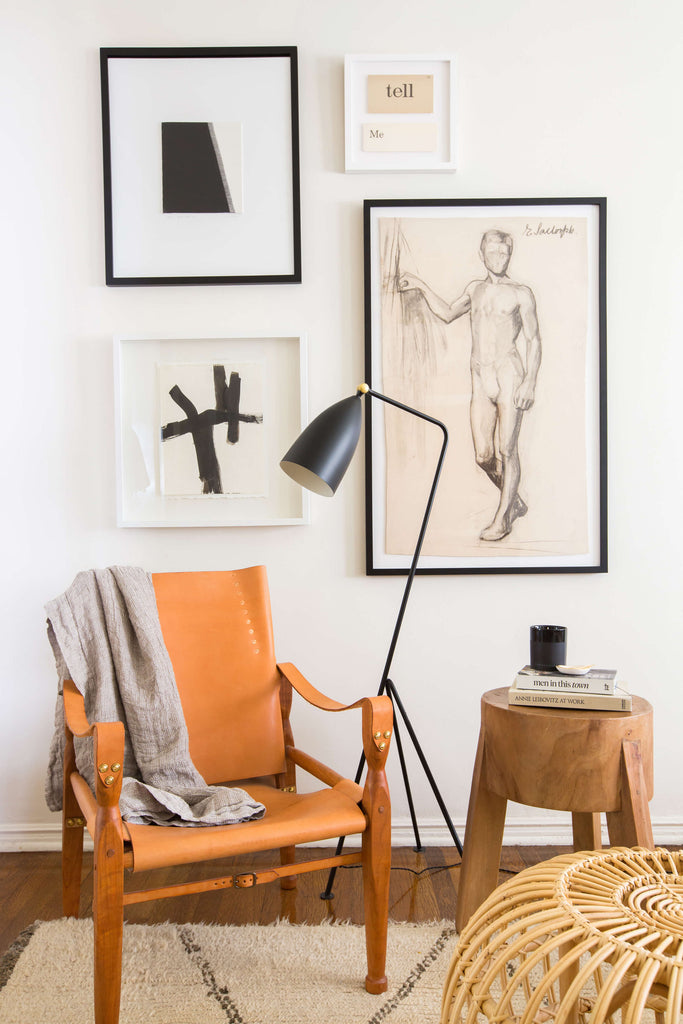
More so than what I want them to notice, it is how I want them to feel. I want my home to feel inviting, comfortable, interesting and warm. I am all about layering classic pieces from different styles to create an eclectic and unique collection. As a prop-stylist I am constantly styling and restyling every surface of my house but my rules stay the same with anything I bring in - stick within a color palette which for me is neutrals (wood, whites, blacks, creams, browns) and then you can always move things around and try out new pieces without the worry that things won’t work next to each other.
What about you; what’s the first thing you notice when you walk into a room?
To say that I don’t notice things and want to sometimes fix them would be a total lie. As a designer, our eyes are trained to see a space and want to make it better - not visually, but for the person that is living there. So often times in my mind I think, “oh if that sofa was here it would open up the room more” or “oh if that art was hung 6” higher it would make the ceilings look taller”. It’s something I have a hard time turning off, but it always comes from a place of love.
Do you have a favorite room to makeover/design?
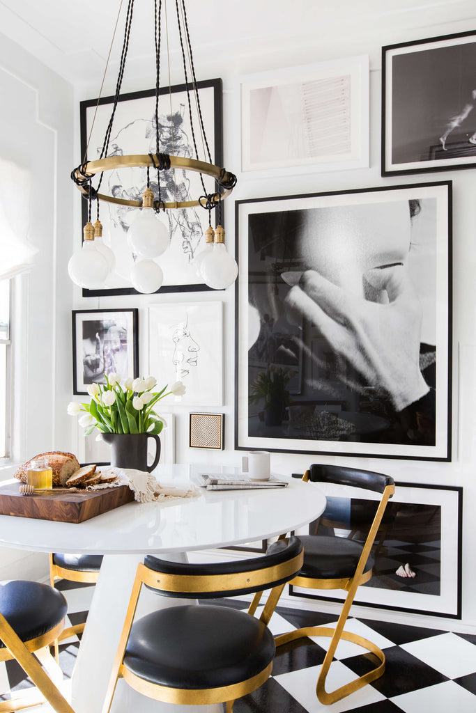
My favorite in my own space was definitely the kitchen. When I moved into the rental it was dark, dingy and dated but had such good bones. I ended up adding peel and stick tiles to the floor, giving everything a coat of fresh white paint, swapping out all the hardware and lighting and adding open shelving on one wall to not only give me more storage but to visually bring the eye up making the space feel bigger.
How would you describe your decor style in your home?
Casual, Collected and Curated. It’s an ever changing blend of those three things. Strict minimalism is not my forte, but I do appreciate clean lines. I love objects, pieces, art, and accessories that tell a story and help the room feel as if it has personality and soul. I’ll always gravitate towards timeless neutrals layered textures. Working as a stylist I constantly am using color and pattern for shoots or spaces every single day so I love coming home to something that feels neutral and monochromatic. It’s timeless without feeling boring, and the neutral palette allows you to bring in a combination of pieces from so many different styles.
From what or whom do you find inspiration?
I’m constantly inspired by other designers. There is something to be said about those that have forged the road before you and have years of real life experience in the field that you are in. I always find myself falling down a rabbit hole on instagram looking through designers accounts or accounts that post rooms from decades before.
What’s one quirky thing that defines your space?
I once heard from someone - “always include something that shouldn’t be there in every vignette”. And while I don’t always adhere to the rule I do believe in it. I think that adding the oddity, or the item that “shouldn’t be there” gives every vignette or room a sense of personality and life. It makes it unique.
How do your Barn & Willow drapes/shades fit into your space?
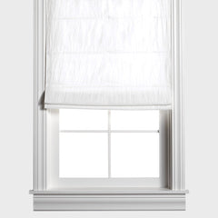
These shades created the perfect warm yet neutral layer in my space. I recently went from a light grey wall to a white wall in our living room and while I loved the bright new look of the space it lacked warmth which is exactly what these linen shades brought ones they were up. They were the perfect tone and style for what the walls needed to add that extra textural layer.
If you had an unlimited budget, what would be the first thing you’d add to your home?
I’ve been coveting just about everything from Michael Robbins lately, specifically his Ranger Sofa. Wood, leather, and linen will always be my goto.
Looking back on where you began your design journey, what’s one thing you would tell younger Brady?
Don’t worry about perfection and try everything.
I am my own worst critic with everything in life. But when it comes to design there is no such thing as perfect. The oddities, the differences and the imperfections are what make a room unique and interesting and early on I often got caught up on the “rules” of design - telling myself, oh you shouldn’t put a lamp there, or oh that doesn’t normally go here. Take the rules and break them. That is what makes you unique.
We like to think that everyone has a special view, be it out your front door or through a kitchen window, that they favor. Tell us about your favorite view in your home!
My favorite spot in our home is sitting in the little breakfast nook attached to our kitchen. It’s the brightest and happiest spot in the house. I filled the walls floor to ceiling with all of my favorite art and more so than the view outside, its the view inside when I’m looking at the space or the people that I am there with.
